


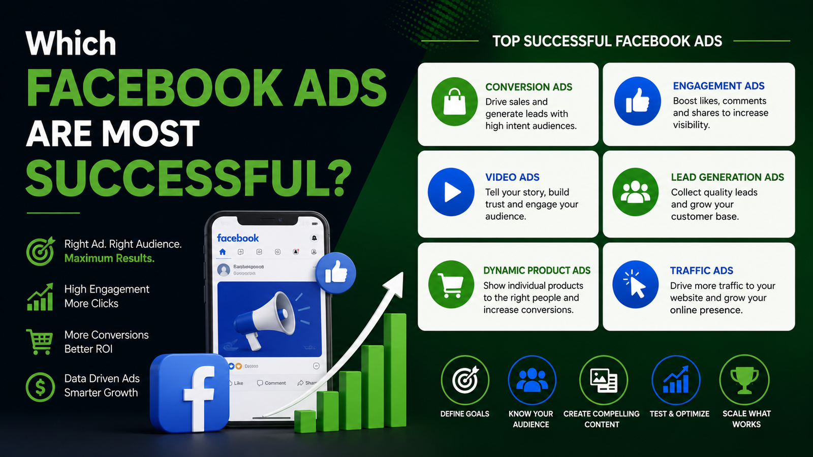
Which Facebook Ads are most successful?
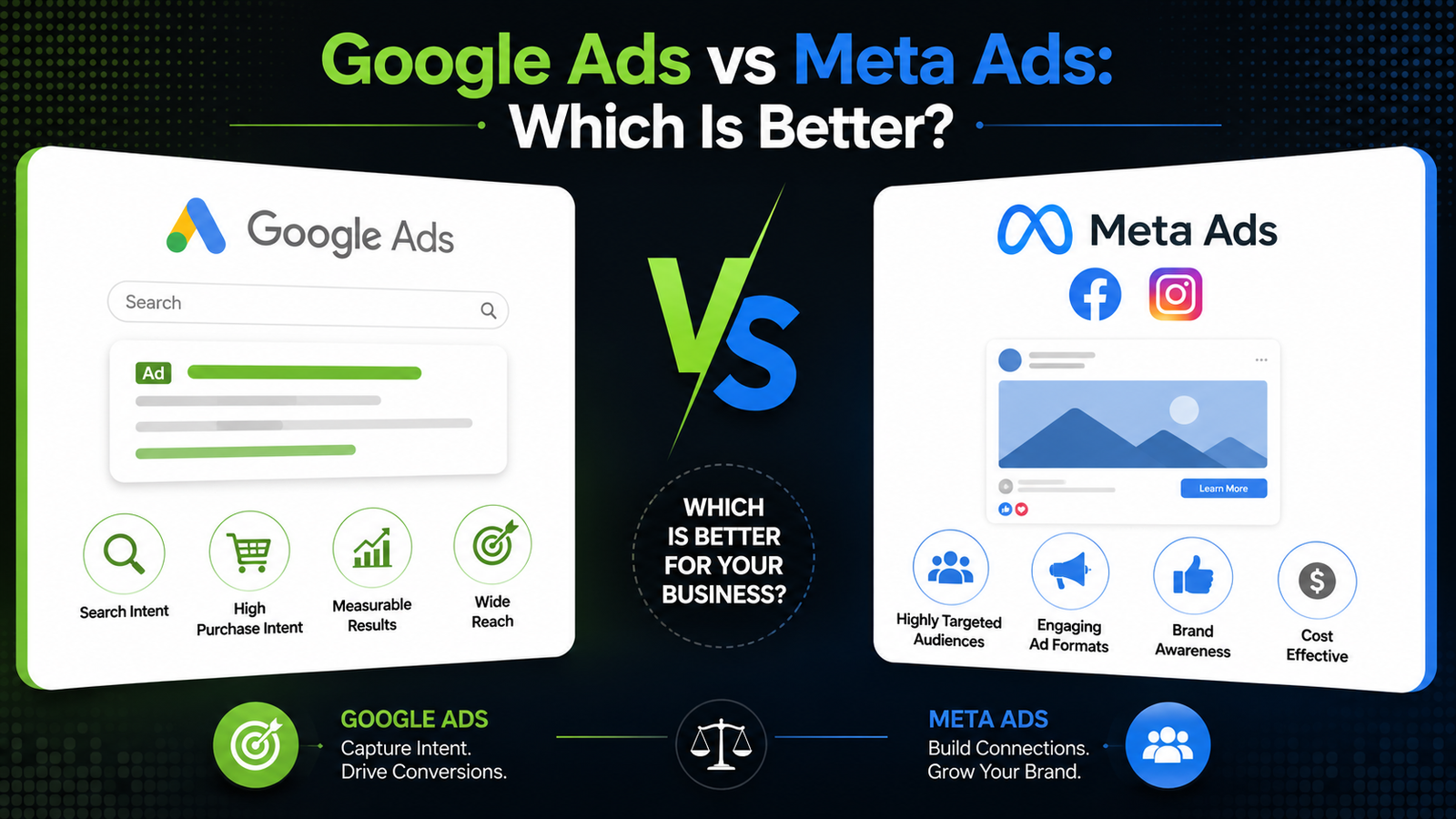
Have you ever scrolled through your social media feed and stopped dead in your tracks because a post felt like it was reading your mind? That usually isn’t a coincidence. Instead, it is the result of a highly optimized digital strategy that knows exactly how to capture your attention. For many business owners, figuring out what actually works on social media can feel like guesswork. The algorithm changes constantly. Because of this, many companies waste thousands of dollars on campaigns that do not generate a single phone call. If you want your business to grow, you cannot rely on guesswork. You need to understand which specific ad formats actively turn casual scrollers into paying customers. For instance, studying a best Facebook ads example from your industry can be very revealing. It shows you the exact visual styles and copywriting formulas that actually work. At 14K Business Solutions, we analyze market data daily to help businesses maximize their return on investment. Let’s look at what makes Facebook ads perform well today and how you can apply those ideas to your own business and build a highly profitable digital presence. The Anatomy of a Winning Ad Campaign First of all, a successful ad does not look like a traditional commercial. In 2026, the best-performing ads blend naturally into people’s social media feeds. The moment people see something that feels overly polished or overly promotional, they usually keep scrolling. This is why it’s critical to understand some basic principles of psychology when creating a Facebook ads campaign. The first few seconds matter most. Your ad should immediately grab attention by highlighting a problem your audience relates to or a benefit they care about. Furthermore, your visual content does most of the heavy lifting. Short-form vertical videos and authentic, behind-the-scenes team photos consistently outperform polished stock imagery. When you analyze a top-tier best Facebook ads example, you will notice a common theme. Specifically, they focus on the transformation of the customer. They do not just list product features. Rather, they show exactly how the service makes life easier or more enjoyable for the buyer. Driving Growth with Local Targeting For brick-and-mortar companies, broad global targeting is a massive waste of marketing spend. If you operate a physical store or provide a regional service, you must focus your budget on your immediate neighborhood. Utilizing a specialized local ad service allows you to pin your advertising directly to specific zip codes and geographic areas. Consequently, you only spend money showing your message to people who live close enough to actually buy from you. Moreover, localized messaging creates an instant sense of community trust. People are much more likely to engage with ads that feel relevant to where they live and the services available in their area. Working with an experienced digital marketing team also helps you fine-tune your targeting so your budget reaches the right audience instead of being wasted on people who are unlikely to become customers. Scaling Your Return on Investment Creating a successful Facebook ads campaign involves ongoing experiments. It also requires constant adjustments based on various data. Once your advertisement is released, you shouldn’t just sit back and wait. You will need to observe important metrics on a regular basis. These include click-through rates and cost-per-acquisition. If a visual is not performing well after several days, it is time to swap it out. Replace it with a new one and keep things moving productively. If the thought of dealing with a complex process makes you feel nervous, you are certainly not alone. Many business owners feel the same way in their everyday operations. Many business owners lack sufficient time to monitor stats and tweak bidding rates constantly. As a result, utilizing a professional local ads service will not only free up your time but also speed up lead generation efforts. Professionals will take care of the technical side of your campaigns. This frees you up to concentrate on providing services to your new customers. Dominate Your Digital Market Today Ultimately, social media advertising remains one of the fastest ways to scale a modern business. However, you must approach it with a clear strategy and the right structural framework. When you build a data-driven Facebook ads campaign, you turn your marketing budget into a reliable client-generation machine. While your competitors continue reaching new customers online, make sure your business isn’t getting left behind. By making use of professional digital marketing, you will have a considerable advantage over your competition in terms of profits. If you’re ready to stop wondering and start launching successful ad campaigns, contact 14K Business Solutions for a digital marketing audit and discover where your biggest opportunities for growth are. FAQs Is $5 a day enough for Facebook ads? Yes. A $5 daily budget is enough to test different audiences, headlines, or creatives before increasing your investment. Which Facebook ad is best for sales? When it comes to direct sales, video ads and carousel ads are very effective for conversion campaigns. This type of ad allows the advertiser to advertise more than one product or to demonstrate the service offered in action. Best Facebook ad examples? The best Facebook ads example choices always feature clear, high-contrast visuals, a simple benefit-driven headline, and a single call to action. In addition, real customer testimonials, before-and-after results, and user-generated content often perform especially well because they feel more authentic.