
People click away from slow or messy websites faster than you think. Does a good digital marketing and advertising company help? Yes! Let me explain.
You spend good money creating solid content and running ads, but if the site feels clunky, most visitors bounce before they see what you offer.
Good user experience changes that.
It keeps people around, helps them find what they need, and turns casual browsers into actual customers.
In the world of digital marketing and advertising company, we see this play out every single day. A website that loads quickly and feels easy to use simply performs better.
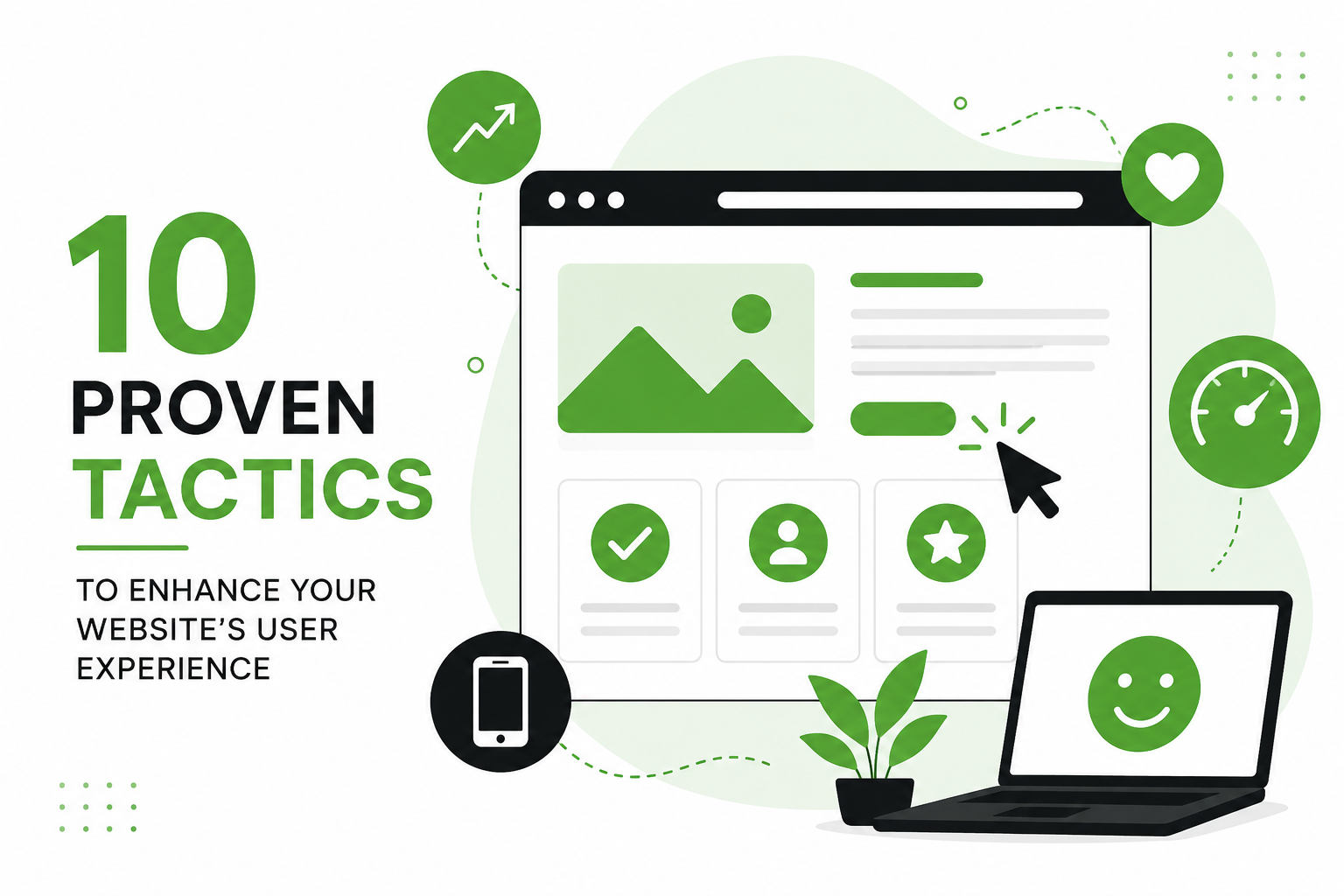
Here are 10 tactics that actually work (take it a secret from best marketing agencies). I’ve seen them lift engagement and conversions for plenty of businesses.
Make Your Pages Load Lightning Fast
Speed matters more than most people admit. If your page takes more than three seconds to load, over half of mobile visitors will leave without even looking around.
A one-second delay can cut conversions by about 7%. For a site making $100,000 a day, that adds up to serious lost revenue, millions over a year.
Most marketing agencies opt to start simple. Compress your images and switch to WebP format. Minify your CSS and JavaScript files. Turn on browser caching. Throw in a good CDN so files travel shorter distances to your visitors.
Test everything with Google PageSpeed Insights regularly. Aim for under two seconds. When you hit that mark, people stick around longer, view more pages, and feel better about your brand right from the first click. This one fix often gives the quickest boost in results.
Build with Mobile Users in Mind First
More than 60% of web traffic now comes from phones. Yet plenty of sites still feel awkward on small screens. Mobile bounce rates often sit around 55-60%, higher than desktop. That gap tells a clear story; people expect smooth experiences no matter the device.
When you get mobile right, you automatically improve user experience for most of your audience. Google likes it too, since mobile-first indexing is the standard now. One bonus: well-optimized mobile sites can see noticeably higher conversion rates.
All the best marketing agencies lay heavy focus on the mobile first design for websites.
Keep Navigation Dead Simple
Complicated menus frustrate people fast. They want to find things without guessing. Stick to clear labels and limit your main menu to five or seven items max.
Add a search bar if your site has more than a few dozen pages. Use breadcrumbs on deeper content so users always know where they are.
Think about how you shop online yourself. You want to move around without confusion. Clean navigation does exactly that. It builds confidence and encourages visitors to explore instead of hitting the back button.
Guide Eyes with Strong Visual Hierarchy
Most visitors scan pages rather than read word for word. Help them by making the important stuff stand out. It is recommended to use bigger, bolder headings, and put key calls-to-action in bright, contrasting colors.
Equally important, add plenty of white space so the page doesn’t feel crammed. Ideally, break text into short paragraphs and use bullet points where they make sense. Consistent alignment across the design helps too.
When everything has a clear order, users understand your message more quickly. They decide faster and take action with less effort. This approach alone can lift time on page and reduce frustration.
Most digital marketing and advertising company pay more than usual time on this aspect.
Streamline Your Forms
Long forms kill momentum. Every extra field increases the chance someone will abandon the process. Ask only for what you truly need.
Show validation messages right away as people type. In case of multi-step forms, add a progress bar so users see how close they are to finishing. Offer a guest option, when possible, instead of forcing account creation.
Small changes here make a big difference. Cleaner forms feel less like work, so more people actually complete them. Test a few versions and watch your completion rates climb.
Make Your Site Accessible to All
A good comprehensive design hurts no one. As an SEO expert would say, always use alt text for images. Ensure text has enough contrast against backgrounds.
Do you know, these small steps help users with disabilities, but they also improve the experience for everyone else. Clearer layouts and better readability benefit all visitors.
Deliver Content That Actually Helps
A beautifully designed website doesn’t hold its own without good content. If you want to create great content here are some pointers:
- Write straightforward headlines that tell people exactly what they’ll get.
- Keep paragraphs short.
- Mix in images or quick videos that support the text without slowing things down.
- Focus on what your visitors are really searching for.
- Answer their questions directly.
When content feels relevant and easy to digest, trust builds naturally. People stay longer and come back more often.
Place Clear Calls-to-Action
Calls to actions aren’t just visuals, they do push the visitors into conversions. If you were to place a call to actions on your website, use words like Get Your Free Quotes or Shop Now!
Also, take your time to place them on the website where they shone the best. Test different colors and positions, but keep the overall design clean. Strong CTAs gently guide users toward the actions you want without feeling pushy.
Watch Real User Behavior with Data
In the real world, guessing and fixing rarely works. But if you can benefit from tools such as heatmaps, to see where people click, scroll, or get stuck.
Do you know the secret lies in bounce rates, time on page, and which pages cause exits. There are tools like Core Web Vitals, Google’s measures for loading speed, interactivity, and visual stability, that give you clear targets to hit.
When you spot problems, fix them based on actual behavior. Data turns opinions into concrete improvements and keeps your site evolving in the right direction.
Test Changes and Keep Improving
Launch a tweak, then measure what happens. Run simple A/B tests on headlines, layouts, or button styles. Talk to a few real users when you can; they often point out issues you missed.
Treat your website like a living project. Visitor expectations shift over time, so regular testing keeps your experience fresh. The sites that improve steadily usually pull ahead of the competition.
How Can You Measure Your Website’s User Experience?
Look at both numbers and real behavior. Track bounce rate, average session time, and conversion rates in Google Analytics. Pay close attention to Core Web Vitals for loading, interactivity, and layout stability.
Heatmaps show where people click and where they lose interest. Short surveys or usability tests add qualitative insights. Combine everything for a full picture, then act on what you learn.
Ready to Take Action?
These tactics deliver real results when you apply them consistently. Speed, simplicity, and user-focused design add up fast.
If you want expert help putting it all together, 14K Business Solutions stands out as one of the best digital marketing and advertising company.
As a strong digital marketing and advertising company, we specialize in website performance optimization and full-scale strategies that drive growth.
We audit sites, spot quick wins, and build plans that fit your goals and budget. Whether you need a refresh or greater improvements, reach out for a free website audit.
Let’s make your site one that visitors love to use, and that actually grows your business.